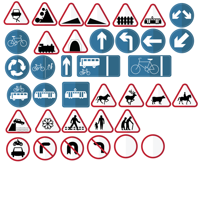
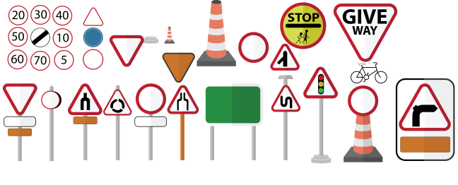
I have based my FMP around the journeys project as part of the imminent city studio. I had noticed the lack in content for road safety awareness for 11-17 year olds within the THINK campaign set out by the government. The aim is to inform readers about road signs which are of particular help when out and about. Be it as pedestrian, cyclist or eventual road theory for driving.
I felt a little overwhelmed at first due to me not finding a way into the subject. I settled with developing my character designs from my workshops for the jobs and journeys projects. I felt that this would be important way to bridge the gap between the information from the highway code to discussing the hobby of riding bikes. After talks with peers, I felt a little more confident that my idea held weight.
I liked having the freedom of media. I used some of my previous knowledge from the last years to create media for the subject area. For example, I used the marvel app to produce a dummy for my app. I also thought that some of the style elements like typography and colour worked out well, informed from my initial research. I disliked the amount of time it took me to get to some of the points that I was creating. A lot of experiments went wrong with the app, map and book. However, I don’t believe this to be a bad experience. This is because it taught me a lot about myself as a designer and showed me the eventual roots to create something more interactive.
I feel like I have worked towards my goal. Although I do not think I have fully achieved it, I have created various media for a target audience to interact with.
I think that I could have interacted with a focus group of 11 year olds to improve my designs more. Unfortunately, I could not schedule a meeting during the process due to time constraints and the various stages of the work I had created at the time.
I think that I would create quicker mock-ups if I were to enact this again. My designs could have used quick mockups to proceed with a focus group which would pull the outcomes more towards the target audience which could have set it apart form regular designs that I have based my research on. I feel that I rushed to produce something that used all of my elements i.e typography and colours to make outcomes.


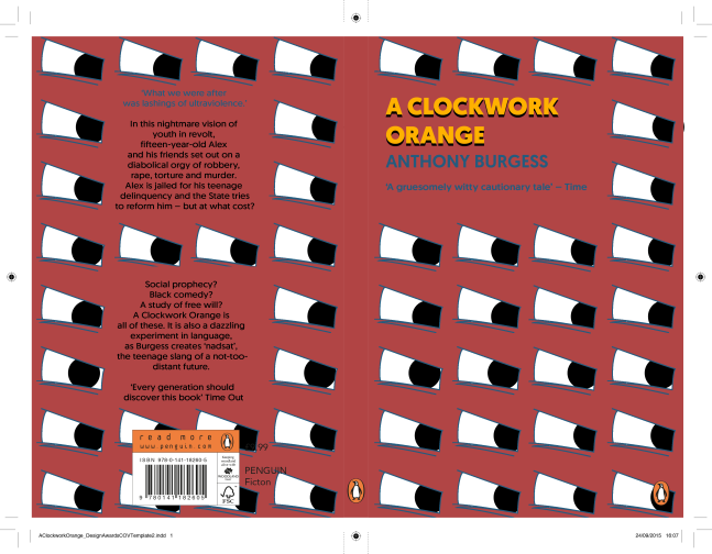

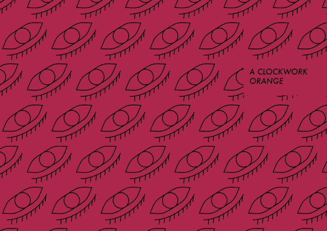 I thought that this would stand out to what I had depicted, and wanted to develop it with a hand-rendered process. As lino cutting makes tessellation and symbolism easier, I decided to use this process. However, this did not turn out well as I had hoped due to the nature of printing and I would rather simplicity and structure to the cover.